Plotting
Last updated on 2025-02-14 | Edit this page
Overview
Questions
- How can I plot my data?
- How can I save my plot for publishing?
Objectives
- Create a time series plot showing a single data set.
- Create a scatter plot showing relationship between two data sets.
matplotlib is the
most widely used scientific plotting library in Python.
- Commonly use a sub-library called
matplotlib.pyplot. - The Jupyter Notebook will render plots inline by default.
- Simple plots are then (fairly) straight-forward to create.
PYTHON
time = [0, 1, 2, 3]
position = [0, 100, 200, 300]

plt.plot(time, position)
plt.xlabel('Time (hr)')
plt.ylabel('Position (km)')
Display All Open Figures
In our Jupyter Notebook example, running the cell should generate the figure directly below the code. The figure is also included in the Notebook document for future viewing. However, other Python environments like an interactive Python session started from a terminal or a Python script executed via the command line require an additional command to display the figure.
Instruct matplotlib to show a figure:
This command can also be used within a Notebook - for instance, to display multiple figures if several are created by a single cell.
Plot data directly from a Pandas dataframe.
You can easily create plots directly from a Pandas dataframes. For example, to create a histogram of the bill_length_mm column in the data_penguins DataFrame, you can use the following code:
PYTHON
import pandas as pd
import matplotlib.pyplot as plt

data_penguins = pd.read_csv('data/data-penguins-named.csv')

data_penguins['bill_length_mm'].plot(kind='hist', bins=5)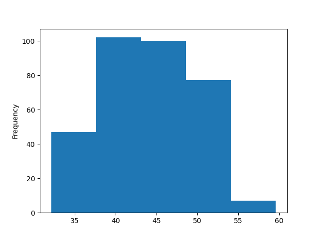
Many styles of plot are available.
Let’s plot scatter plot to see the correlation between bill length
and body mass of penguins using matplotlib.
- First you need to select figure size using figure parameter in
.figuremethod underfigsizeparameter.
- Use scatter method to plot a scatterplot.
- Finally, add additinal information like title, and x and y axis names
Full code:
PYTHON
plt.figure(figsize=(4,4))
plt.scatter(data_penguins['bill_length_mm'], data_penguins['body_mass_g'])
plt.title('bill_length_mm vs body_mass_g')
plt.xlabel('bill_length_mm')
plt.ylabel('body_mass_g')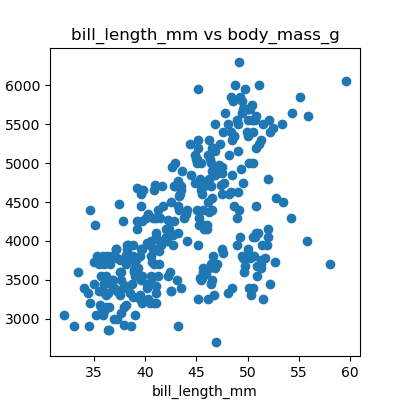
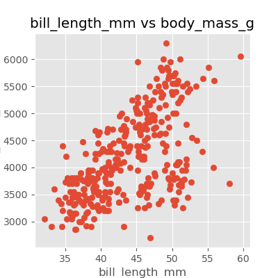
Using different styles for plots.
You can choose plots style with matplotlib (more
here). We can re-create the previous scatter plot using the style
from the widely used ggplot2 package for R by setting the style to
‘ggplot’:
Data can also be plotted by using seaborn.
Plots in python are usually plotted using matplotlib and
seaborn. Here is an example of plotting the same scatter
plot using seaborn with points coloured by species.
PYTHON
import seaborn as sns

plt.figure(figsize=(4,4))
sns.scatterplot(data=data_penguins, x='bill_length_mm', y='body_mass_g', hue='species')

plt.title('bill_length_mm vs body_mass_g')
plt.xlabel('bill_length_mm')
plt.ylabel('body_mass_g')
plt.legend()
We can also add a slope line which describes the correlation between
the points, providing additional information about the data. We can do
this by calculating the slope and intercept of the line using the
numpy library and then plotting the line using the
plot method.
PYTHON
import seaborn as sns

plt.figure(figsize=(4,4))
sns.scatterplot(data=data_penguins, x='bill_length_mm', y='body_mass_g', hue='species')

plt.title('bill_length_mm vs body_mass_g')
plt.xlabel('bill_length_mm')
plt.ylabel('body_mass_g')
plt.legend()

import numpy as np
slope, intercept = np.polyfit(data_penguins['bill_length_mm'], data_penguins['body_mass_g'], 1) # 1 because linear (polynomial)
x = np.linspace(data_penguins['bill_length_mm'].min(), data_penguins['bill_length_mm'].max(), 100)
y = slope * x + intercept
plt.plot(x, y, color='black', label=f'Linear fit: y = {slope:.2f}x + {intercept:.2f}')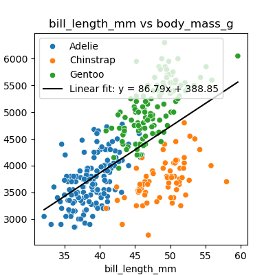
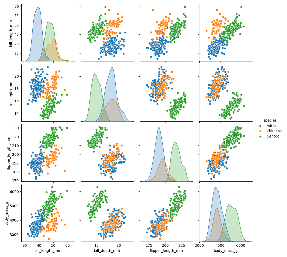
The pairplot function in seaborn is a powerful tool for
visualising relationships between multiple variables in a dataset and
get a comprehensive overview of the dataset:
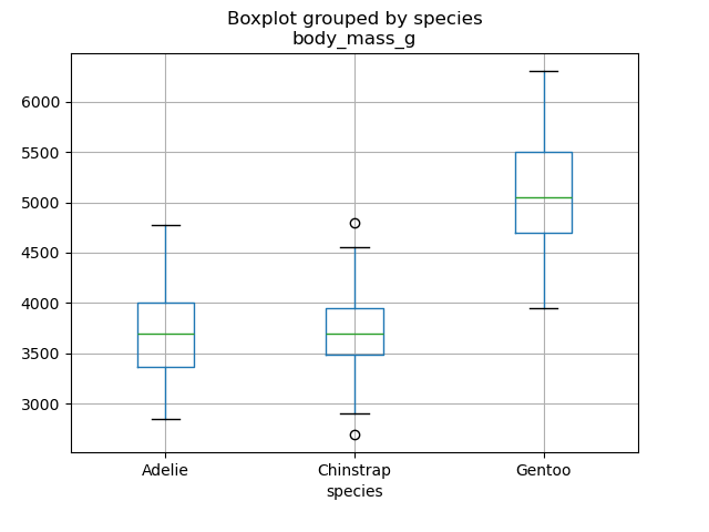
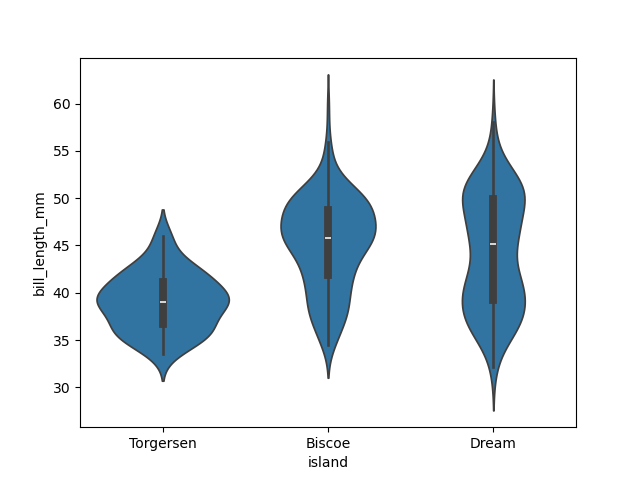
Exploring other useful types of plots with seaborn
Use seaborn documentation to create the following
plots:
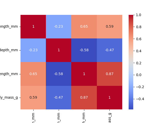
- Boxplot - plot variation of body mass of the penguins by species
- Violin - plot variation of bil length of the penguins by their location (island)
- Heatmap - plot a heat map showing correlation between numerical features in the plot (hint: you first need to find out how to create a correlation matrix).
Saving your plot to a file
If you are satisfied with the plot you see you may want to save it to a file, perhaps to include it in a publication. There is a function in the matplotlib.pyplot module that accomplishes this: savefig. Calling this function, e.g. with
will save the current figure to the file my_figure.png.
The file format will automatically be deduced from the file name
extension (other formats are pdf, ps, eps and svg).
It is also important to note that you can specify the DPI (dots per inch) when saving a figure with plt. Here’s a basic example:
In this example, dpi=300 will save the figure at 300 DPI, which is a good quality for printing. This is also important if you are creating a figure for journal articles, where there are specific DPI standards.
Note that functions in plt refer to a global figure
variable and after a figure has been displayed to the screen (e.g. with
plt.show) matplotlib will make this variable refer to a new
empty figure. Therefore, make sure you call plt.savefig
before the plot is displayed to the screen, otherwise you may find a
file with an empty plot.
When using dataframes, data is often generated and plotted to screen
in one line. In addition to using plt.savefig, we can save
a reference to the current figure in a local variable (with
plt.gcf) and call the savefig class method
from that variable to save the figure to file.
Making your plots accessible
Whenever you are generating plots to go into a paper or a presentation, there are a few things you can do to make sure that everyone can understand your plots.
- Always make sure your text is large enough to read. Use the
fontsizeparameter inxlabel,ylabel,title, andlegend, andtick_paramswithlabelsizeto increase the text size of the numbers on your axes. - Similarly, you should make your graph elements easy to see. Use
sto increase the size of your scatterplot markers andlinewidthto increase the sizes of your plot lines. - Using color (and nothing else) to distinguish between different plot
elements will make your plots unreadable to anyone who is colorblind, or
who happens to have a black-and-white office printer. For lines, the
linestyleparameter lets you use different types of lines. For scatterplots,markerlets you change the shape of your points. If you’re unsure about your colors, you can use Coblis or Color Oracle to simulate what your plots would look like to those with colorblindness.
-
matplotlibis the most widely used scientific plotting library in Python. - Plot data directly from a Pandas dataframe.
- Select and transform data, then plot it.
- Many styles of plot are available: see the Python Graph Gallery for more options.
- Can plot many sets of data together.
More examples of plots.
In both matplotlib and seaborn, you can
plot many types of plots:
- Scatter Plots: useful for visualising relationships between two continuous variables.
- Histograms: great for showing the distribution of a single continuous variable.
- Bar Plots: effective for comparing categorical data.
- Line Plots: ideal for displaying trends over time or continuous data.
In the following example, we create a histogram to visualize the distribution of flipper lengths in the penguins dataset. This plot will help us understand how flipper lengths vary across the population.
PYTHON
plt.figure(figsize=(4,4))
# code for matplotlib
# plt.hist(data['flipper_length_mm'], bins=20)
sns.histplot(data=data_penguins, x='flipper_length_mm', bins=20)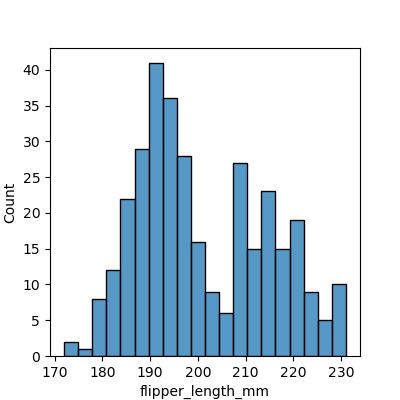
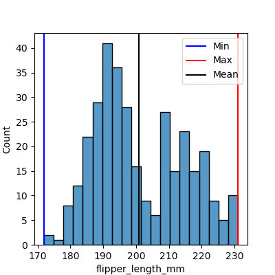
Enhancing plots with additional metrics.
It is important to make your diagram display useful statistics. For
histograms, you can display minimum and maximum values as well as the
mean value using .axvline() method.
PYTHON
plt.figure(figsize=(4,4))
sns.histplot(data=data_penguins, x='flipper_length_mm', bins=20)

plt.axvline(data_penguins['flipper_length_mm'].min(), label='Min', color='blue')
plt.axvline(data_penguins['flipper_length_mm'].max(), label='Max', color='red')
plt.axvline(data_penguins['flipper_length_mm'].mean(), label='Mean', color='black')
plt.legend()