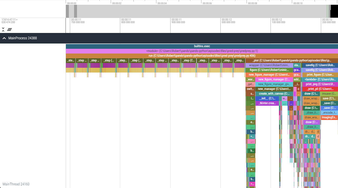
Image 1 of 1: ‘A viztracer timeline of the execution of the Pred-Prey exercise from later in the course. There is a shallow repeating pattern on the left side which corresponds to model steps, the right side instead has a range of 'icicles' which correspond to the deep call hierarchies of matplotlib generating a graph.’
An example timeline visualisation provided by
viztracer/vizviewer.
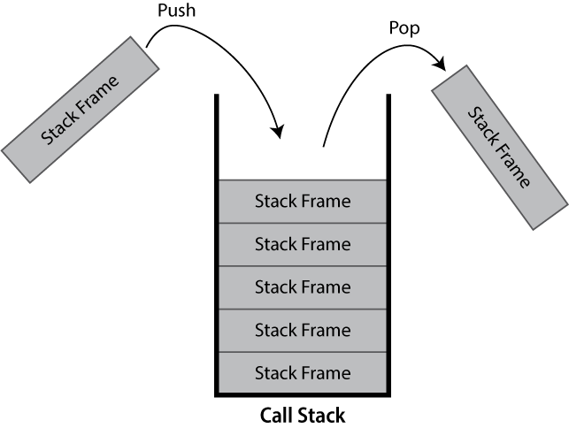
Image 1 of 1: ‘A greyscale diagram showing a (call)stack, containing 5 stack frame. Two additional stack frames are shown outside the stack, one is marked as entering the call stack with an arrow labelled push and the other is marked as exiting the call stack labelled pop.’
A diagram of a call stack
Figure 2
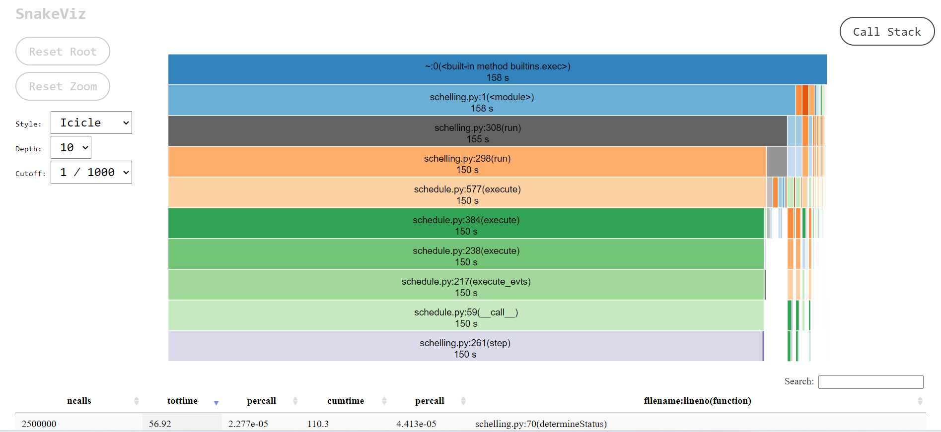
Image 1 of 1: ‘A web page, with a central diagram representing a call-stack, with the root at the top and the horizontal axis representing the duration of each call. Below this diagram is the top of a table detailing the statistics of individual methods.’
An example of the default ‘icicle’ visualisation
provided by snakeviz.
Figure 3
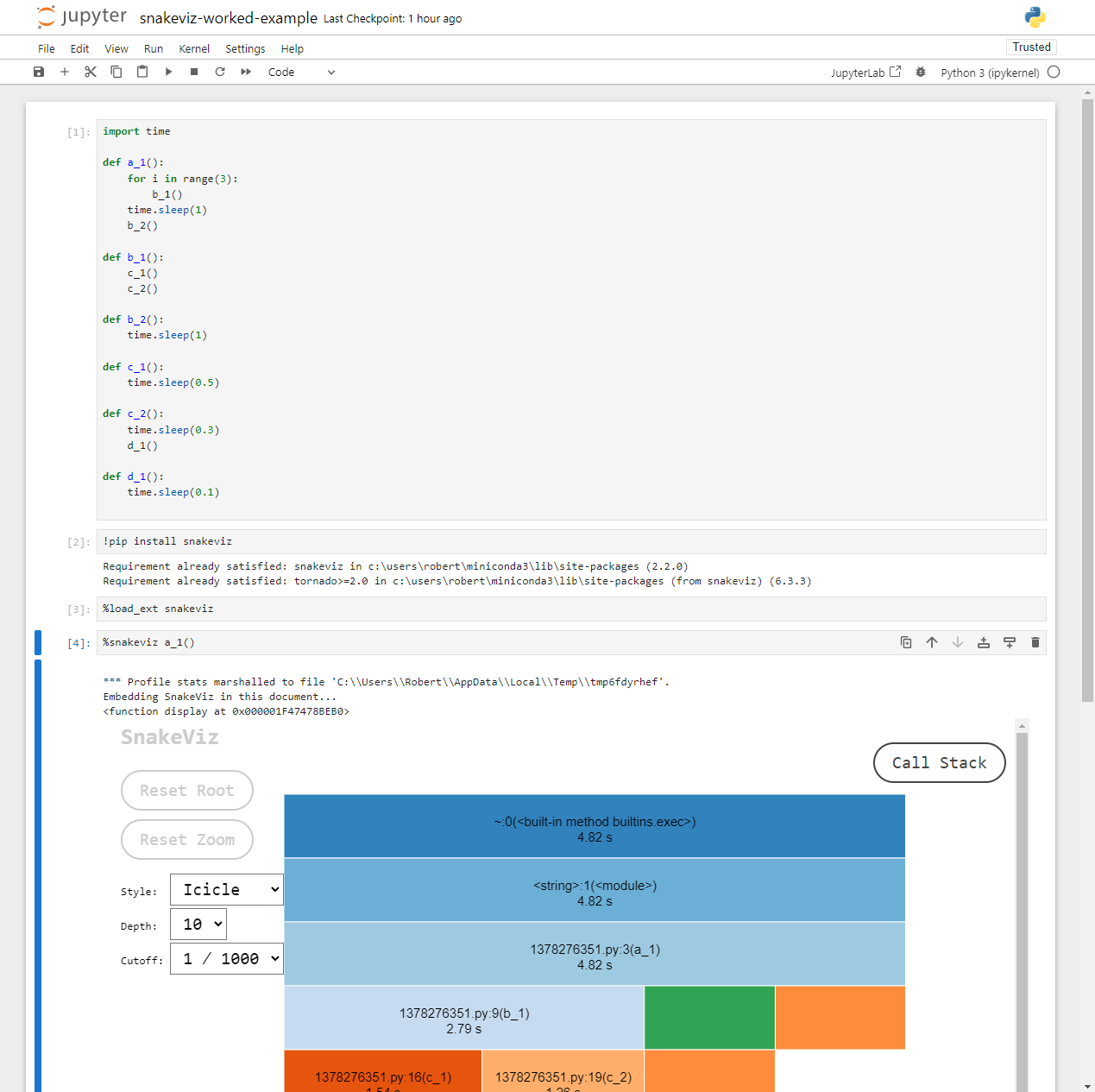
Image 1 of 1: ‘The snakeviz icicle visualisation for the worked example Python code.’
An icicle visualisation provided by
snakeviz for the above Python code.
Figure 4
Image 1 of 1: ‘A Jupyter notebook showing the worked example profiled with snakeviz.’
The worked example inside a notebook.
Figure 5
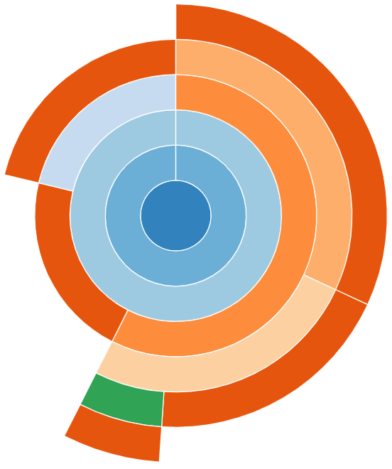
Image 1 of 1: ‘A sunburst visualisation for the worked example Python code.’
An sunburst visualisation provided by
snakeviz for the worked example’s Python code.
Figure 6
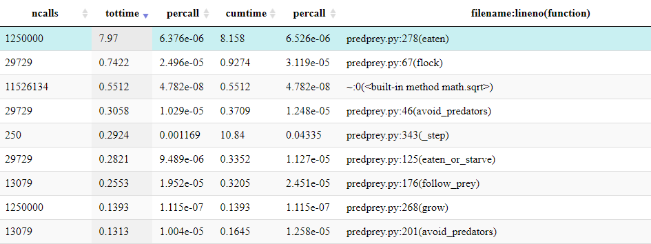
Image 1 of 1: ‘The top 9 rows of the table shown by snakeviz when profiling predprey.py. The top row shows that predprey.py:278(eaten) was called 1,250,000 times, taking a total time of 8 seconds. The table is ordered in descending total time, with the next row taking a mere 0.74 seconds.’
The top of the table shown by snakeviz.
Figure 7
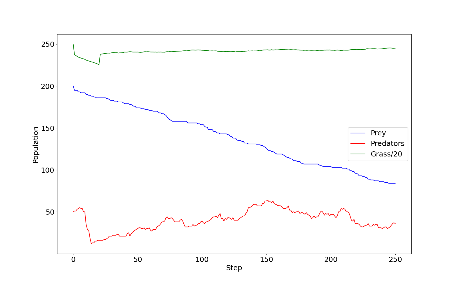
Image 1 of 1: ‘A line graph plotting population over time through 250 steps of the pred prey model. Grass/20, shown in green, has a brief dip in the first 30 steps, but recovers holding steady at approximately 240 (4800 agents). Prey, shown in blue, starts at 200, quickly drops to around 185, before levelling off for steps and then slowly declining to a final value of 50. The data for predators, shown in red, has significantly more noise. There are 50 predators to begin, this rises briefly before falling to around 10, from here it noisily grows to around 70 by step 250 with several larger declines during the growth.’
predprey_out.png as produced by the
default configuration of predprey.py.
Image 1 of 1: ‘A screenshot of the `line_profiler` output from the previous code block, where the code within the line contents column has basic highlighting.’
Rich (highlighted) console output provided by
line_profiler for the above FizzBuzz profile code.
Figure 2
Image 1 of 1: ‘A screenshot of the line_profiler output from the previous code block inside a Jupyter notebook.’
Output provided by line_profiler
inside a Juypter notebook for the above FizzBuzz profile code.
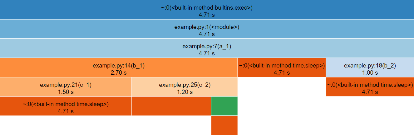
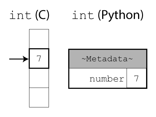
Image 1 of 1: ‘A diagram illustrating the difference between integers in C and Python. In C, the integer is a raw number in memory. In Python, it additionally contains a header with metadata.’
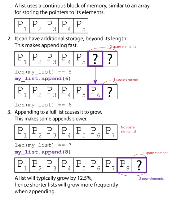
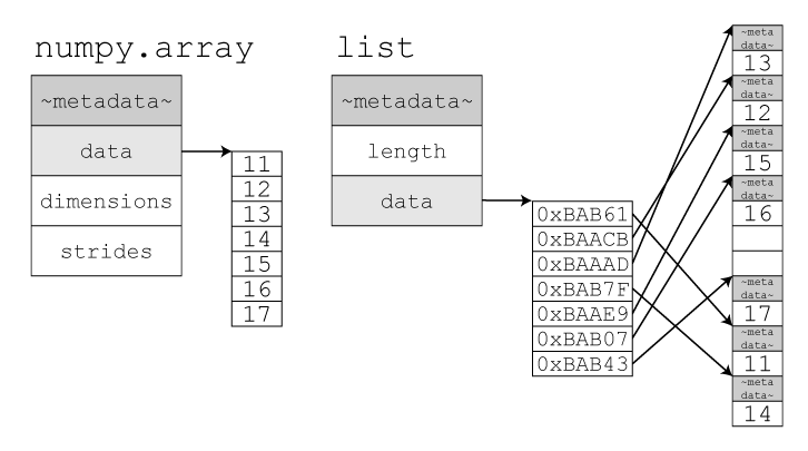
Image 1 of 1: ‘A list uses a contiguous block of memory, similar to an array, for storing the pointers to its elements. It is depicted as a series of five adjacent boxes, labelled 'P1' to 'P5', representing pointers to the list's elements. It can have additional storage beyond its length to make appends faster. An illustration shows the previous list with two extra empty boxes marked with question marks, indicating spare elements. Below, Python code `len(my_list) == 5` and `my_list.append(6)` is shown. After appending, the first of the previously empty boxes contains 'P6', and the last one remains empty. The length is now `len(my_list) == 6`. Appending to a full list causes it to grow. This makes some appends slower. An illustration depicts a full list with 'P1' through 'P7' in adjacent boxes and a label "No spare elements!". Below, Python code `len(my_list) == 7` and `my_list.append(8)` is shown. The result is a new, larger continuous block of memory with 'P1' through 'P8' followed by a question mark in an additional box, indicating one spare element. The label "2 new elements" with curved arrows suggests that when the list grows, it typically allocates more memory than just the space for the new element. A concluding note states that a list will typically grow by 12.5%, hence shorter lists will grow more frequently when appending.’
A visual diagram of list storage.
Figure 2
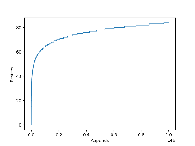
Image 1 of 1: ‘A line graph displaying the relationship between the number of calls to append() and the number of internal resizes of a CPython list. It has a logarithmic relationship, at 1 million appends there have been 84 internal resizes.’
The relationship between the number of appends
to an empty list, and the number of internal resizes in CPython.
Figure 3
Image 1 of 1: ‘An image of a single long bookshelf, with a large number of books.’
A bookshelf corresponding to a Python
list.
Figure 4
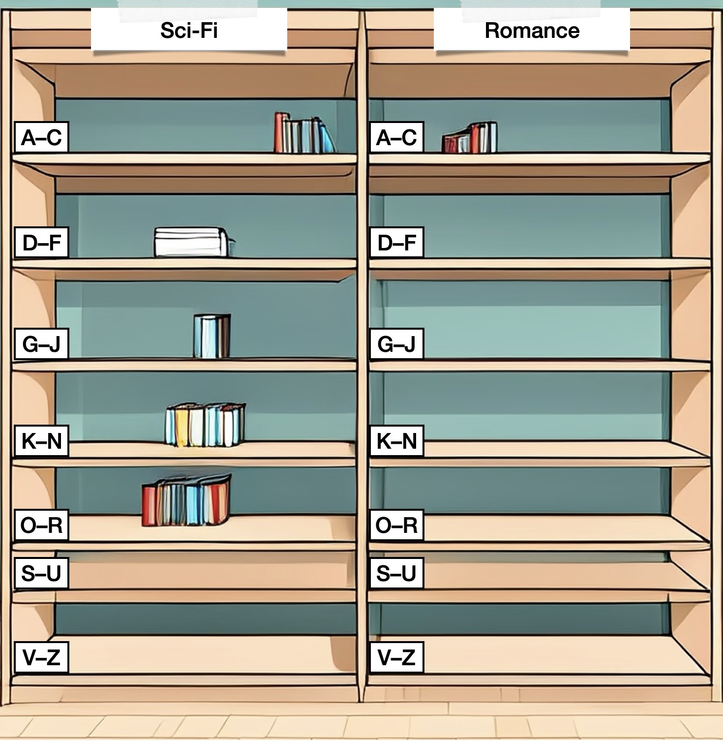
Image 1 of 1: ‘An image of two bookcases, labelled "Sci-Fi" and "Romance". Each bookcase contains shelves labelled in alphabetical order, with zero or few books on each shelf.’
Image 1 of 1: ‘A diagram illustrating the difference between a NumPy array and a Python list. The NumPy array is a raw block of memory containing numerical values. A Python list contains a header with metadata and multiple items, each of which is a reference to another Python object with its own header and value.’
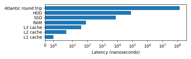
Image 1 of 1: ‘A horizontal bar chart displaying the relative latencies for L1/L2/L3 cache, RAM, SSD, HDD and a packet being sent from London to California and back. These latencies range from 1 nanosecond to 140 milliseconds and are displayed with a log scale.’
A graph demonstrating the wide variety of
latencies a programmer may experience when accessing data.